Art Technique

Understanding Copics and How to get started

Copic markers have quickly become one of my favorite materials to use. In this post, I will be focusing on the Copic Sketch line and will try to be as honest as possible.

So lets get started!

First of all, Copics are expensive. At an art store, an individual marker can retail around $7-$9 but you can find them way cheaper online for around $4.50 each. So consider them an investment. There are 358 colors available in the line which includes, 12 color families, four gray families, two shades of black and a blender marker (see Exhibit 1). I would suggest purchasing the 72 piece sets first to save money per marker. 

Exhibit 1: Copic Color Chart courtesy of Imagination International Inc.

Exhibit 2

The color families may seem like gibberish when you first glance at it but this is a life-saver (see Exhibit 2)! I printed out the blank chart and as I accumulated more and more markers I would shade their respective boxes. The colors on your computer screen may differ slightly from what you own so this way you know the true color. 

Exhibit 3: Blending example

Since Copics are alcohol based markers, this makes them blend beautifully but you can't expect any color combo to work . The most seamless gradient can be achieved by two methods. The first method is pretty straightforward. Let's use the color family or Broad Classification of 'B' as an example which consists of true blue colors (see Exhibit 3). The next identifier after the color family is the blending group (intermediate classification) and are considered the most ideal for blending together. Within that color family you can start coloring from light to dark which is shown by the third identifier, the specific value/brightness. The lower the number, the lighter it is.

The second way to have a beautiful gradient is by using the color's respective shades of gray. I would suggest using the warm grays for warm colors (red, yellow, etc.) and the cool grays for the cool colors (blue, purple, etc.) In my blending example, I matched B12 with shades of cool gray. Just using one color and only blending with grays in the same color family will make a huge difference!

While using Copics, you have to consider what you will be using them for. I've seen comic book artists, architects, interior designers and more using these materials. If you lean toward portraiture, I would get the shades that work well for skin tones along with some of the warm and cool gray tones. It wouldn't make sense to get colors like a neon pink if you were drawing a person right? 

As a personal preference, I rarely ever use the black shades or the blender marker. Instead of use black markers, I would rather use shades of gray to deepen the color I'm working with. I believe that this technique provides more depth and doesn't leave the drawing looking so flat. The blender marker can be used for some cool effects and some subtle clean up, but I'm not too keen on using it. Contrary to its name, I think that the blender just pushes around the alcohol in the markers and leaves a weird oily effect. But if you are interested in how to use the blender marker, there are plenty of other great resources out there! 

Essentially, you just need to play around. If you want to dip your toes in, get a blending trio pack sold by Copic and try some of the methods I shared. Remember that you only learn by doing. When I first started using Copics, I got very frustrated because I wasn't familiar with the medium. I kept on experimenting and made the material my own.

I hope you enjoyed this quickie intro to Copic Sketch markers. I plan on elaborating further with future blog posts. Have fun!

LA Adventure part 2 - Downtown LA

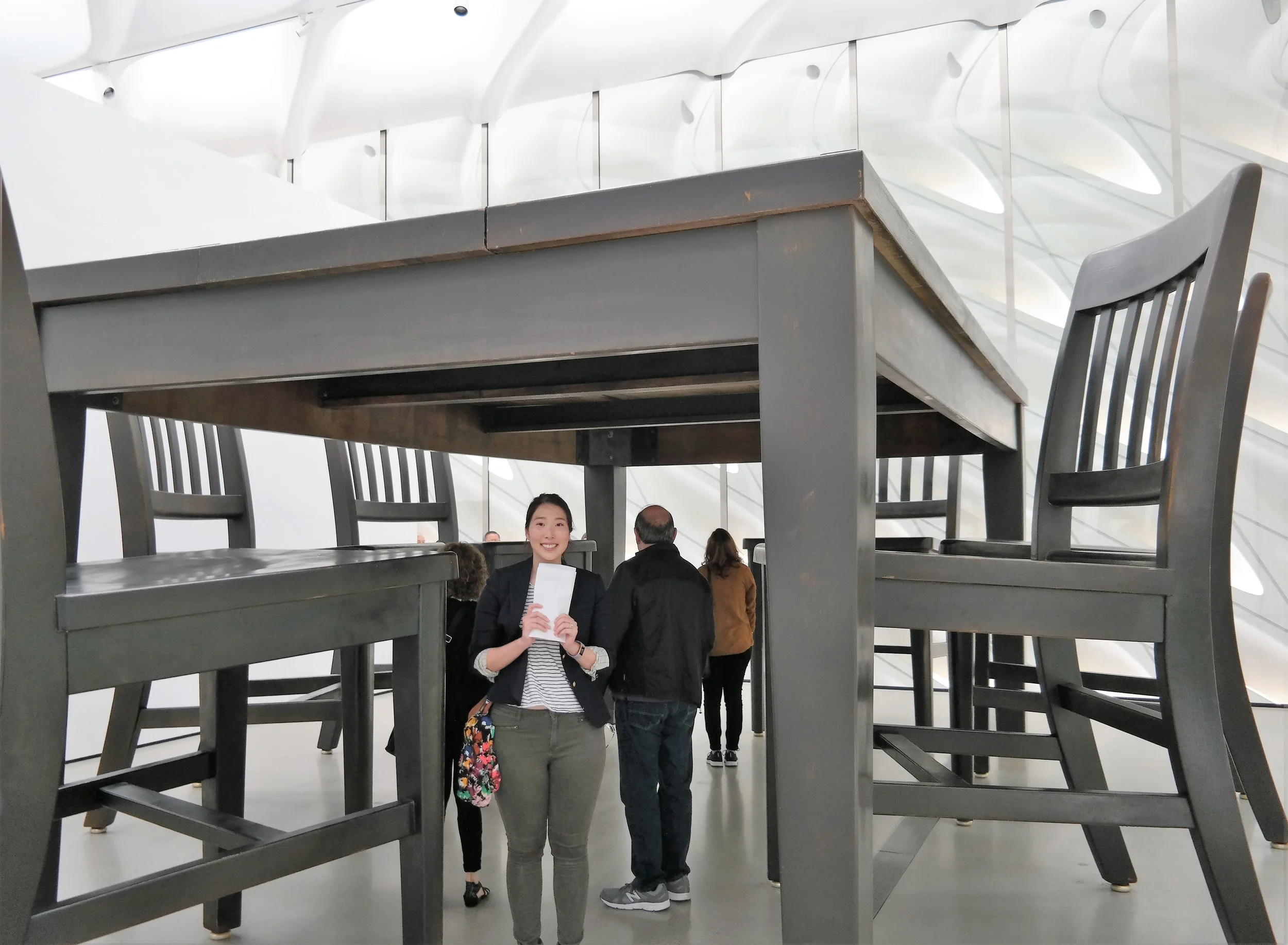
The only museum we visited during our trip to LA was the Broad, a contemporary art museum in the heart of Downtown. The museum itself is on the smaller side consisting of three floors with only two being used for exhibits. Tickets to the Broad itself is free, but on a first come first served basis. I had to reserve tickets and a time slot a month in advance in order to just get in! Individuals for each time slot have to wait patiently in line until they are ushered in. Then you can actually sign up for a time to visit the main attraction. 

Justin and me in the Infinity Mirrored Room.

The main attraction of the Broad at the moment is Yayoi Kusama's Infinity Mirrored Room. We had to wait two hours just to get in line for the room itself. The staff were very strict and everything is done electronically. When checking in, you are put on a virtual queue counting down to your opportunity to see what most people were dying to see. It is basically a 10X10' box with mirrors on all sides including the ceiling. There are various light fixtures hanging from the ceiling. Each party (usually people go in by themselves) has exactly 45 seconds to enjoy the room. The guy at the door seriously had a stopwatch. My husband and I went in together. The lights would flash every now and then and cause us to feel slightly disoriented. But when the lights would flash back on we felt like we were part of a galaxy. The background of the picture above looks like a cityscape while we are floating in space. Overall I feel like the exhibit was well worth the wait.

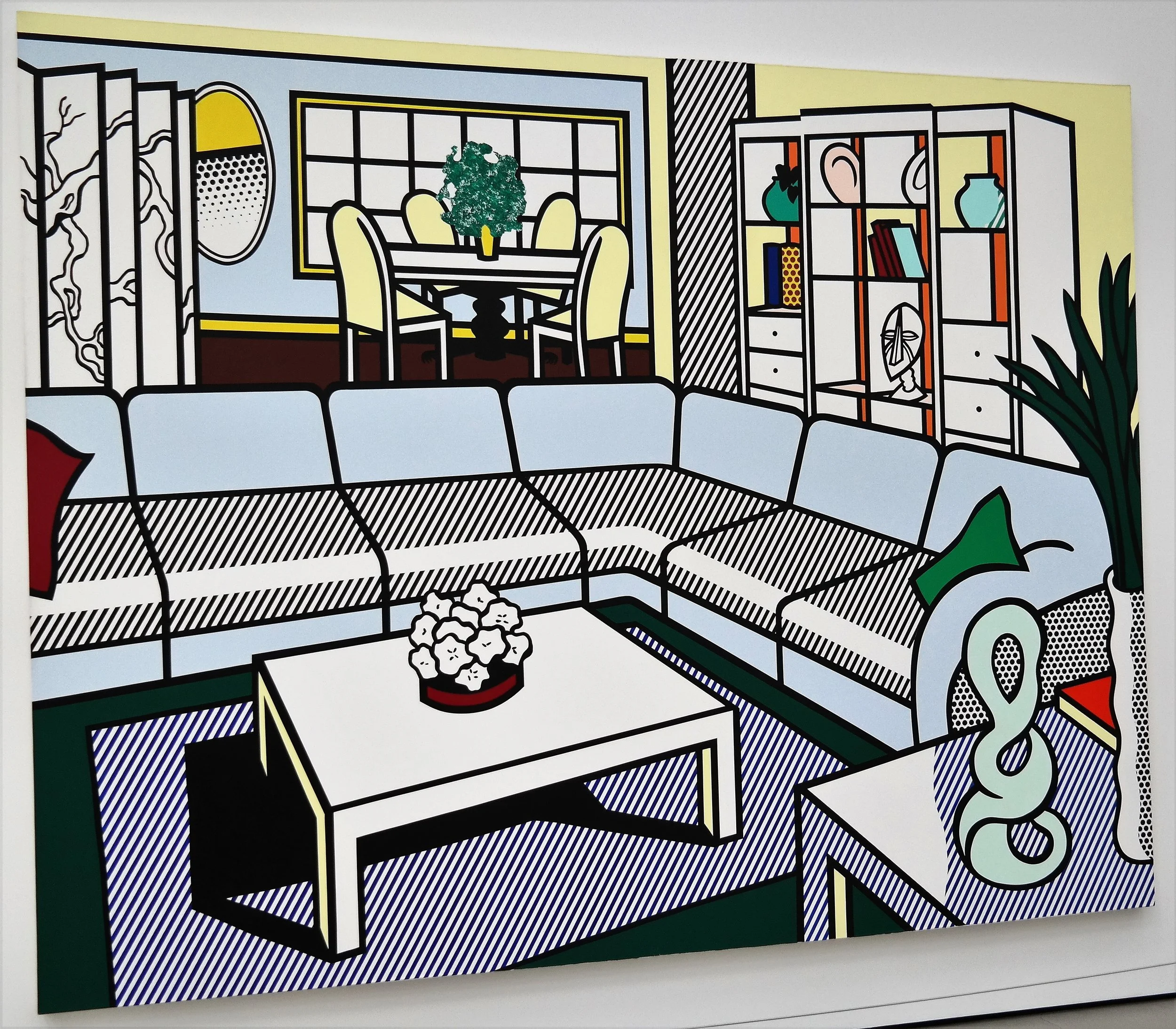
While waiting for the Infinity Mirrored Room, my husband and I explored the general admission exhibits. We saw some of the famous Andy Warhol's Campbell's Soup paintings, beautiful paintings by Mark Tansey (a new favorite of mine), a bunch of Roy Lichtenstein pieces and many more.

Watery Ecstatic Series by Ellen Gallagher, 2004.

Another featured exhibit was called "Creature". According to the Broad website, "Ranging from artworks that examine the human body, to others that allude to a physical presence outside of the artwork itself, Creature offers an array of lenses through which to view the human experience, some scientifically based and others drawing inspiration from cultural representations of how living things change over time." There was a variety of pieces from the deranged to the adorable. To be honest, the pieces that meant to shock and awe really turned me off, which I guess was the point. There was one artist that stood out for me, her name is Ellen Gallagher. She uses a cut-paper process to portray marine life. She paints parts of her drawings bringing a sense of fantasy and whimsy that I adore.

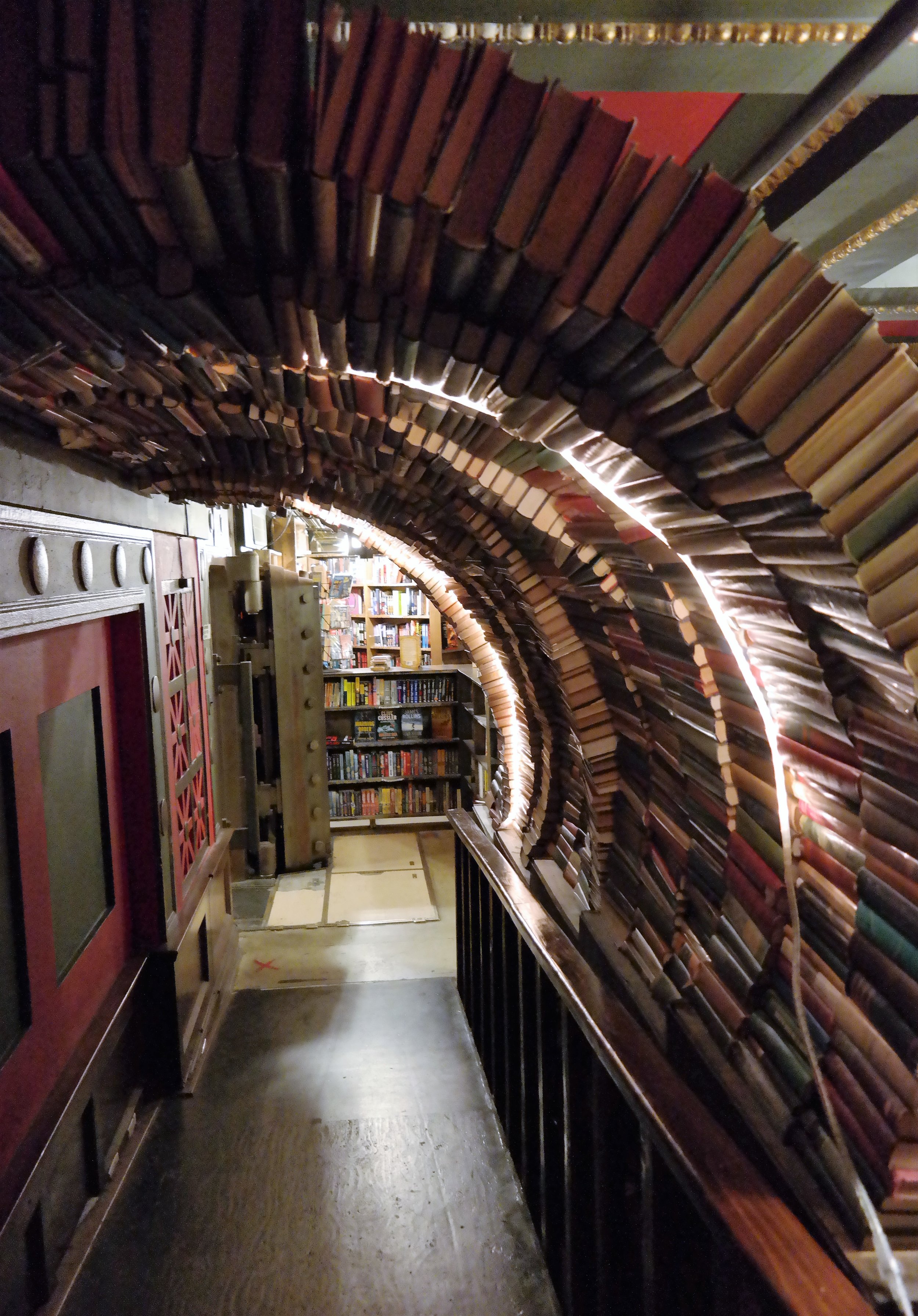
An art piece made out of books in the Last Bookstore.

In addition to the museum, I really loved our visit to the Last Bookstore. They literally have an upstairs section of books called the labyrinth! It felt like a fun maze filled with the smell of used books. The store itself has two stories filled with books and local art. There is a comfy sitting area on the first floor with well used couches and armchairs. All over the walls were various expressions of art including an art gallery on the second floor. Tiny little shops were also located on the same floor where they sold locally made products. I highly recommend going to this bookstore if you love to read as much as I do!

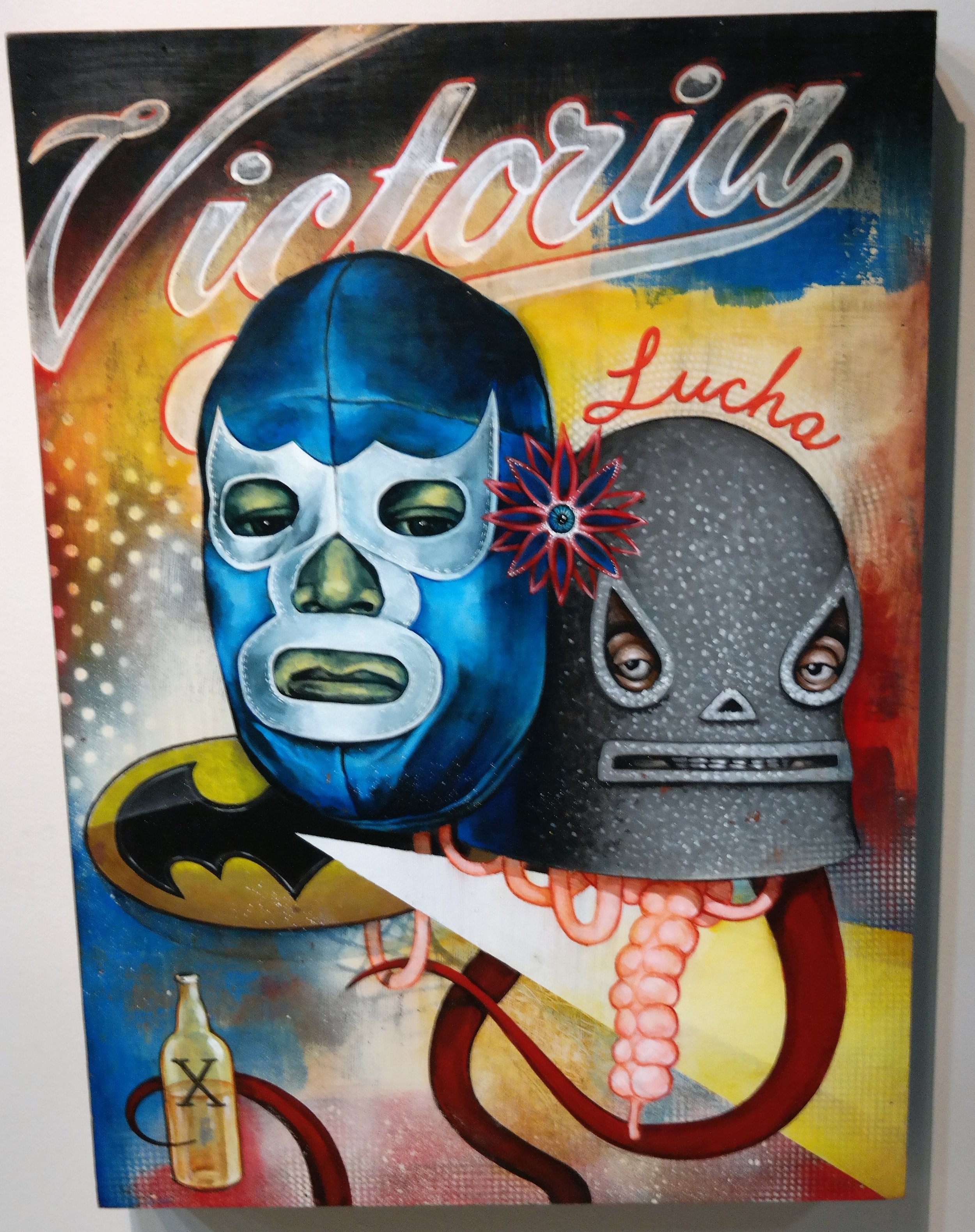
I've attached more pictures of the beautiful artwork that we enjoyed viewing during our time in Downtown LA. Enjoy and be inspired!

I hate Acrylics, why I use oils

The aftermath of the Paint off!

The aftermath of the Paint off!

My husband challenged me to a paint off but…using acrylic paints. He chose the subject to paint (anything from the game Halo Reach) and we proceeded to do our best. Some trash talk happened, well more so on my end, and we worked while listening to a horror podcast. Ultimately, Justin gave up and I was proclaimed the winner. I chose to leave my painting unfinished because I hate Acrylics. Now, that is a strong word but it is one of my huge dislikes in mediums.

Justin's finished painting "Halo Rebels"

Justin's finished painting "Halo Rebels"

While painting our Halo Reach subjects, my husband had mentioned that the paint wasn’t drying off fast enough. I said that the paint was drying too quickly! What I love about oils is the drying time. It gives me the flexibility to change my mind about things. I can go back to a previously painted spot and alter and manipulate what was already on the canvas. I can further build up the colors and add texture without feeling that sticky/tacky semi-dried layer through my paintbrush that I get with Acrylics. There is this thing that happens when you put a thicker glob of acrylic paint on a canvas, it just dries like Elmer’s glue. There remains a goopy silhouette of the bristles from the paintbrush. Don’t get me wrong, I am amazed at how other artists use the medium and the amount of skill involved, but oils give me more satisfaction.

I remember when I was in middle school, and I ended up getting an oil painting set for Christmas. I’ve been begging my mom for this starter set of Winsor & Newton oil paints including within a wooden carrying box with a wooden palette and some mediums. I felt like a real Artist. At first, I had no idea how to use them. Back then, there wasn’t YouTube or other easily accessible guides for me to reference, but with time and experimentation, I improved my skill and love for the medium.

I also enjoyed the feeling of exclusivity that came with using oils. They are by no means an affordable material. Considering that an oil painter needs mediums, Turpentine, brushes and other various tools, it’s not for the faint of heart. Using oils also requires some finesse. Most of my peers preferred to use acrylics if they chose to paint at all due to its ready availability and ease of use.

Beside the feel and finish of oils, I liked the tradition behind oils. I imagine the old Masters mixing their own pigments using a limited palette. There is this one scene in the movie "Ever After" where Leonardo da Vinci is painting a portrait of Drew Barrymore's character. For some reason I always think of that scene and how simple yet beautiful it was. 

I value the patience and careful planning involved in order to create a beautiful piece using oils. I love how oils give you the option to manipulate colors and layer over dry or wet layers. I also love the effect of using your fingers to blend the paint. While painting my subject during the paint off, a head-shot of a Spartan soldier, I tried blending the paint with my fingers but it ended up just completely lifting off of the canvas. I’m not sure if it was due to the quality of the tools I was using as we were reluctant to spend too much just on this competition and settled for student level paints.

I keep on looking back at my unfinished painting. Justin had urged me to finish it as he believes that the quality is good. I don’t disagree, I just don’t see the point in using my limited amount of energy before carpal tunnel kicks in. The entire time I painting, I thought to myself, “I wish these were oils”.

My unfinished painting "Untitled"

My unfinished painting "Untitled"

I think what I learned is that it’s good for me to take a break from my good friend and practice using other materials. Besides this competition, I’ve also been sketching a lot lately. I believe that improving my skills with other tools and mediums is only going to make me better as an Artist while giving me different perspectives and ideas for future projects. Today has definitely cemented my appreciation for oils and how much I look forward to using them in the future.  

What is your preferred medium and why? Let me know in the comments!

Now that is controversial: Using reference photos

Planning my portrait of Chewie

Planning my portrait of Chewie

I was at a workshop called “Composition in Photography”. During the introductions, I mentioned that I was a painter. The purpose of me taking the workshop was to understand composition in general and also to get a different perspective. I mentioned that I like to use photos that I take myself as references for my art. The response that I got from the instructor was, “Now that is controversial”.

That set me thinking. I understand the uses of other people’s photos due to copyright issues. In this case I use what I have taken myself, so there is no issue there.

I’ve heard some artists say that the use of reference photos was “cheating”. Cheating at what per se? According to some research that I did and of course personal experience, using reference photos has a bad rap. It implies that the artist is simply copying and limiting the creative process. I’ve even heard it referred to as lazy. According to a dissenter of the practice interviewed by the Huffington Post’s Daniel Grant for the article “Are Painters’ ‘Reference Photographs’ a Form of Cheating?”:

“Photographs have the tendency to flatten forms, he said, which may suit artists whose intention is to show how photographs depict the world, but it is not the world that they see and experience. The larger problem of relying too heavily on photographs is that they “stunt one’s sense of confidence. You are depending not on your own perceptions but on a foreign eye to tell you what’s out there, what truth is.”

But here is my argument promoting the practice. A camera shows an image from its own perspective. It captures things that the human eye can’t. It also works the same way for the human eye. The camera lacks emotion while the person viewing what is shot is creating a memory. To be honest, I’ve never been one to completely rely on my own memory regarding proportions and various other details. I’ve stuck to what I knew would be the most efficient which was recording and cataloguing. I still go back to old photographs taken God knows when and I see the potential in them. I don’t aim to copy the photo exactly. I interpret what was captured and in turn I convey how I feel onto a canvas.

After choosing a photo as a reference, I proceed to edit and manipulate the photo through Adobe Photoshop Elements. The use of these tools allows me to add different levels of light and dark, saturation and temperature. I can also crop the sections desired. Once satisfied, I print out the photo for a hardcopy reference. I use the hardcopy and also view the details on my computer screen while planning and creating my current project. I know that achieving the same details and colors from the reference photo are impossible. Which gives me more creative room to play. I then see colors and shades that weren’t there before. I invent a personality for the piece which reflects my own. At the completion of a painting, as long as the piece conveys emotions, a story and most of all interest, I believe that the piece was worth all the effort.

In response to the “controversial” comment, I said yes it may be, but I like to do it this way. I think art is an ever evolving beast. As subjective as art is, so are the tools used to create it. The process in itself allows me to think and explore using various different perspectives, my own or of others. I believe the journey itself is Art and the tangible painting left after the journey ends is something to be appreciated. 

I hope everyone has a Merry Christmas, Happy Hanukkah and Happy Holidays!